Your Cart is Empty


Selecting a suitable container
In the second of this three part blog series on repotting I thought I would quickly show you how important pot or container selection is and how changing the container can influence the entire planting. I am in the very fortunate position to have a fairly large selection of pots to draw from but all is not lost if you don't. Simply take the tree you wish to repot with you to your local retail or bonsai nursery {or preferably order one from us!} and try matching it with a container. I would however strongly suggest that when you see a pot you like, you purchase it as I have heard too many people tell me that wanted a pot I stocked and when they came back to buy it I no longer stock it.
I should also point out that a bonsai tree is not grown in its final container. When a tree is young and developing you should use a container large enough to allow faster development ie using sacrifice branching to develop which will require extra room for corresponding root development. Such a container could be a plastic tray , a homemade wooden box or a terra-cotta clay pot. As the tree nears its final shape you will use increasingly smaller containers, which will in turn slow development. When mature and you are only maintaining it, you want to avoid energetic growth and therefore need to select an appropriately smaller container.
This post should also be read together with my rather detailed article on choosing a bonsai pot. Some of the theory discussed in that article will be put to use in the following exercise.
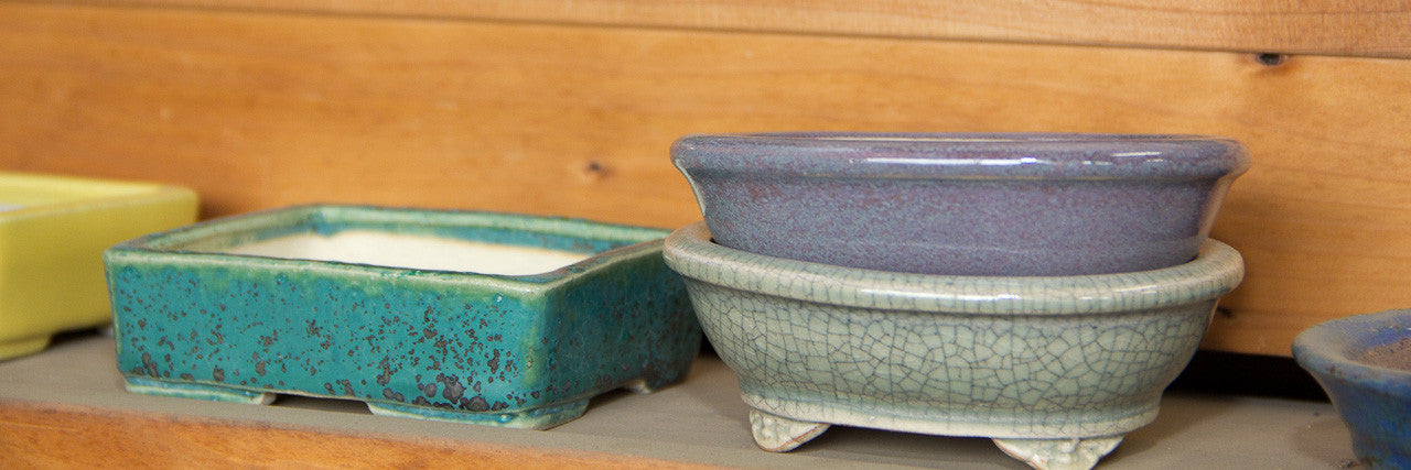
All the pots I have used are handmade in the Tokoname prefecture of Japan, historically famous for bonsai ceramics. Most of them are old, show signs of use and display a patina. This gives them character much like an antique piece of furniture, so needless to say you do not scrub this "dirt" off. It makes sense to add an old, mature tree to an old pot which has also developed character of its own.
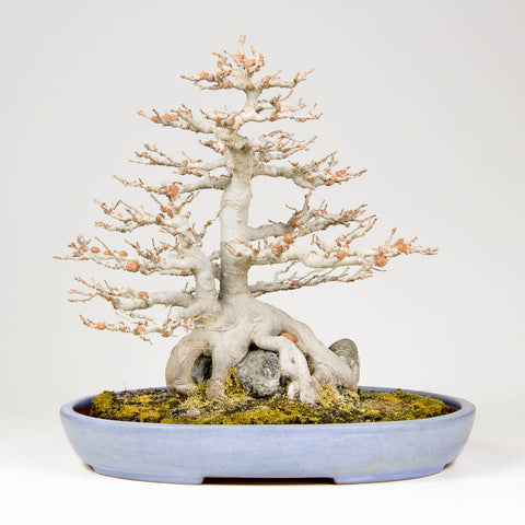
Option 1

This is the container the tree has been in for the last one or two growing seasons. The ceramic artist who made these pots had a very particular glaze which not only readily takes on a patina but with its surface texture adds a level of interest to the planting. The combination of pot and tree works well during winter when all the leaves have dropped as the colours are very harmonious. In autumn when all the leaves are in shades of oranges, reds and yellows this container really blends well.
One should not only consider aesthetically how the combination appears but also the horticultural requirements or implications, that is to say "Can I keep the tree alive in this container through the seasons?" The depth is ok for a tree at this level of development but as Tridents have such energetic root systems it does require frequent repotting. The length and width are also in balance with the canopy of the tree, provided it is kept at this size. The oval shape is well suited to the rounded canopy or outline of the bonsai. The feet are quite decorative, hard to see in the photo unfortunately, but as they are quite set in from the sides it seems to suggest that the planting is floating. The shape of the walls of the pot further enhance this effect.
A nice combination and an option in strong contention in my opinion.
Option 2

This is probably more of a forest container but still works with this twin trunk planting. The colour has the same effect as Option 1 and is harmonious with the trunk and the autumn foliage colours.
It will provide a little more space for root development in a horizontal plain however it is very shallow. So it may be necessary to mound a little soil under the tree and rock. Shallow pots such as these also retain more water than deeper containers, however this is not a problem for a Trident as they love water, and in fact at this stage of refinement you want the growth of the tree to slow down to ensure you can achieve delicate branching instead of rampant, thick shoots and greater water retention will contribute to this.
The raised rim on the lip seems to make the pot a little more formal, although the oval shape is soft and complementary to the shape of the tree.
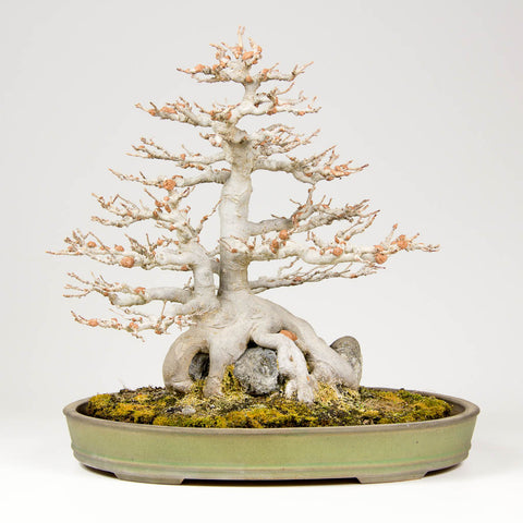
Option 3

In this option we are considering an aged green container which will work harmoniously with the leaves in spring and summer. Green is essentially a universally acceptable colour which will work with all trees. As the pot is aged it does not have the glossy finish which it most likely had when it was new. This and the patina it has built up over the years compliments the age of the tree.
Although the length of it seems in balance with the planting, it does seem a little deep. If the tree were a little younger and needed more time for development I think this container would have been a strong contender. However at this stage it might allow too much growth and it will be difficult to balance water retention and oxygen flow in the excess growing medium required by the tree. Due to its depth however, it will drain better than the previous two options, so if watering is a technique you have not yet mastered this might be a good option.
The plain sides and lack of lip keeps the pot understated and does not challenge the tree for the attention of the viewer.
Option 4

I've thrown in this relatively new unglazed container from the Yamaaki kiln so we can take a look at what influence the absence of a coloured glaze will have on the overall impression. Some enthusiasts almost exclusively use unglazed containers and I believe their motivation for this is that trees grow in the ground and as soil is brown, the container should be symbolic of this. If that's the reasoning that's ok, however I would suggest the reason could be a little less symbolic and more to do with the glaze on the pots commonly available in South Africa. As mentioned above, these pots are all old, so the shiny glaze which would have once been visible when it was new has now faded. As bonsai is still relatively new in our country there are few glazed pots that exhibit this character yet. The answer is to look around for aged pots which were imported 20 to 30 years ago, or start aging them yourself by buying more pots than you need right now and placing them outside where they can be subjected to the elements and the aging process can begin.
Back to this option though.To me the contrast between the light bark and container is crude, unsympathetic and confrontational. The same I believe could be said when the leaves emerge in their bright greens, maturing to a bottle green sort of colour. The overall shape and size is not unpleasant but the raised lip begins to hint at formality and restraint once again. It is also perhaps a little too long for the tree which if you were wanting to create a planting with more of a landscape or plane feel would be desirable.
This particular colour clay might not be as suited as perhaps something with a more grey tint to it, which might have complemented the stone a little more.
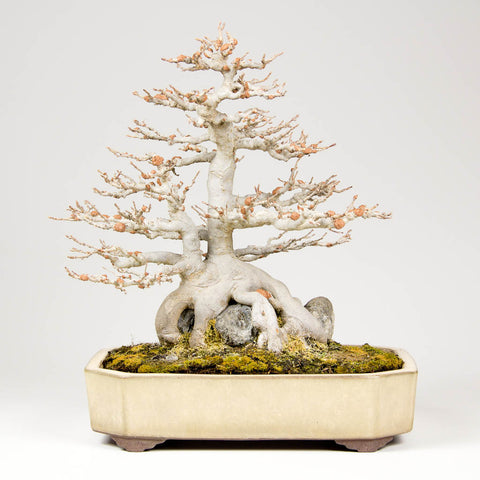
Option 5
This powdery blue is a very pleasant colour, which is perhaps why it is possibly the most commonly used for deciduous trees as it complements the leaves very well. I love working with pots of this colour as it absolutely works with everything (not pines and junipers though) so a pot of this colour in your collection will never go unused for long. The overall impression is subtle and subdued, which really appeals to me. You will often see maples both Trident and Japanese varieties, potted in containers of this colour as they are suitable year round.
The shape, design and size is very much the same as Option 3, so the comments made there are quite applicable here too. The simple, almost inconspicuous feet are very subtle and perhaps more decorative feet might complement the elegant tree a little better.
The angled sides might suggest it could actually be used with a tree with a larger canopy. Perhaps a more vertical side would look better?
Option 6

This popular glaze is called Namako or "sea cucumber." It's an interesting glaze as there is great depth of colour. We have some dark and light blues, some cream (the unglazed clay on the feet), some brown and even a little bit of a yellow hue to the whole pot. The colours, however pleasing they might be do not make up for the fact that the pot is simply too heavy or masculine for this feminine tree. It would most likely be better suited to a powerful, upright Hackberry or some other such species.
If you compare this combination to for instance the appearance of the combination in Option 1, you will see just how much of a difference surface texture of the pot and the shape of the sides can make to the overall impression to the viewer. Once again the inconspicuous feet add to the feeling of weight or perhaps described in another way, grounding the tree much more.
Option 7
This combination is interesting as its an old pot, which at one stage was possibly a more vivid green. After years of exposure to the sun and rain, the colour has faded tremendously and it is now a very subtle green with strong yellow hues. So with a pot like this we get the best of both harmonious colours in autumn and spring/autumn.
The depth is adequate, but not overly deep so growth will be controlled. The length is appropriate for the size of tree and is neither too short that the tree feels like it has been squashed into it, nor is it too big that it feels loose.
The straight side walls with raised rims however make the tree a little more formal although the oval shape is sympathetic to the style of tree.
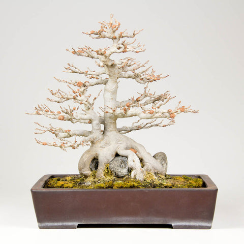
Option 8 - Current actual combination
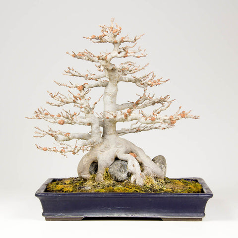
At a Taiken-ten exhibition in Japan I attended a few years ago I remember seeing the most exquisite maple planted in a very rare Tofukiji pot. This planting reminds me a lot of that.
The deep blue contrasts well with the light, warm hues of the trunk and branches. Its colour will also complement the leaves very well in spring as they emerge in "autumn" colours and then mature to green. The patina and surface texture (not easily visible on the photo) combines well with the age of the tree.
The rectangular pot at first perhaps seems a little rigid and geometric, however rectangular pots are often used to suggest a cutout or section of a landscape, suggesting it extends beyond the borders the artist has defined.
The physical dimensions of the pot are in balance with the size of the tree and the depth is satisfactory also from both an aesthetic point of view as well as horticultural.
Option 9
Another unglazed pot to consider, perhaps. I'm sure you will agree with me that it overwhelms the tree somewhat. This is largely due to the depth of it. That feeling of grounding the tree is very strong in this combination, as it is not only created by the outward tapering sides but also by continuing straight into the feet.
The colour is a little more pleasing however than the previous unglazed option proposed. There is also a more interesting variation in brown hues, whereas the previous unglazed option was a visually solid, dark colour. The patina on this container is also much more pleasing and in this sense, and probably only this, is it complementary to the tree.
As in option 8, the shape suggests a kind of cutout of this tree from a greater landscape. The plain sides lacking in decoration do not detract from the pot but does not in any way enhance the delicacy of the tree. Not a contender really for this feminine tree, and would be much better suited to a more masculine pine for example.
Option 10
This is a very interesting combination to me. The container seems very stately, perhaps even "imperial". The very fine carved detail on the feet is unfortunately lost in the photo but I know it to be there. The colour and more accurately, the patina is very pleasing during the period in which I enjoy viewing this tree most ie. during winter when it is devoid of leaves. The pot has taken on a very soft almost pastel like feel to it and works wonderfully with the tree.
The length is perhaps a little short and it might be that although the length might be physically as long as some of the others, where we found the length acceptable, the cut corners makes them appear shorter. The depth is also a little too much for this tree, not only for cultivation purposes but also as the tree visually feels too heavy.
Despite the drawbacks described above, this option may well be a consideration.
Option 11

Most of the containers we have considered above are sized fairly well, and are suited to the size of the tree. Take note I am not referring to rules here, my considerations are purely aesthetic, and so should yours be also. Here we take a look at what happens when we place the tree into a large oval container. Immediately the tree has more room to stretch, and a feeling of spaciousness is suggested. This in turns makes us think of a tree in a field or other location as your eyes are led not only down the tree, past the pot and onto the table as is the case with the other options we have considered. Here your eyes are left wandering off to the sides. If this is the reaction you want in the viewer then this is one of the devices you can use to create the effect.
The colour is similar to option 8 and can be quite pleasing, depending on what makes you feel more comfortable or at ease with the planting. The contrasting blue certainly gives a very different feeling to that of option 10 and many of the others where the colour was more harmonious rather than contrasting.
The depth of the pot is once again a little too much and perhaps something shallower in the same style and colour would be more suitable.
In this option there is no differentiation between the pot and feet as they are both glazed. What do you think the effect of that is compared to perhaps option 6?
P.S Although the above containers are not antiques they are still valuable. Rather than risk damaging them, wherever possible I try to find a cheaper, growing pot of the same size and shape. I will pot the tree into that and when it is to be displayed at an exhibition or event its a quick changeover - kinda like getting dressed up for a special occasion!
13 Responses


Leave a comment
Comments will be approved before showing up.
Bill Rayner
September 06, 2015
Number 3. It feels soft and elegennt. But not overstated to be attracting too much attention from the tree. My opinion is the color is natural and can be versatile .